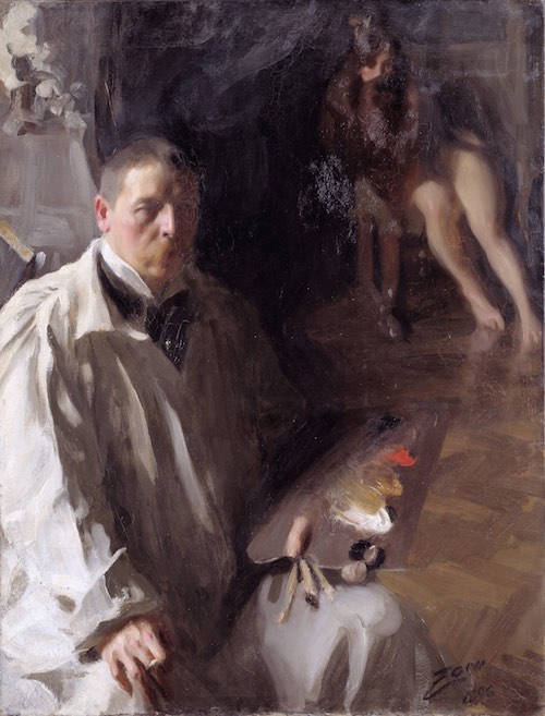
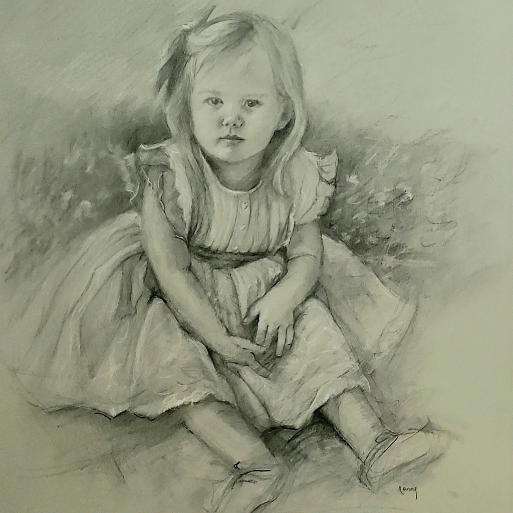
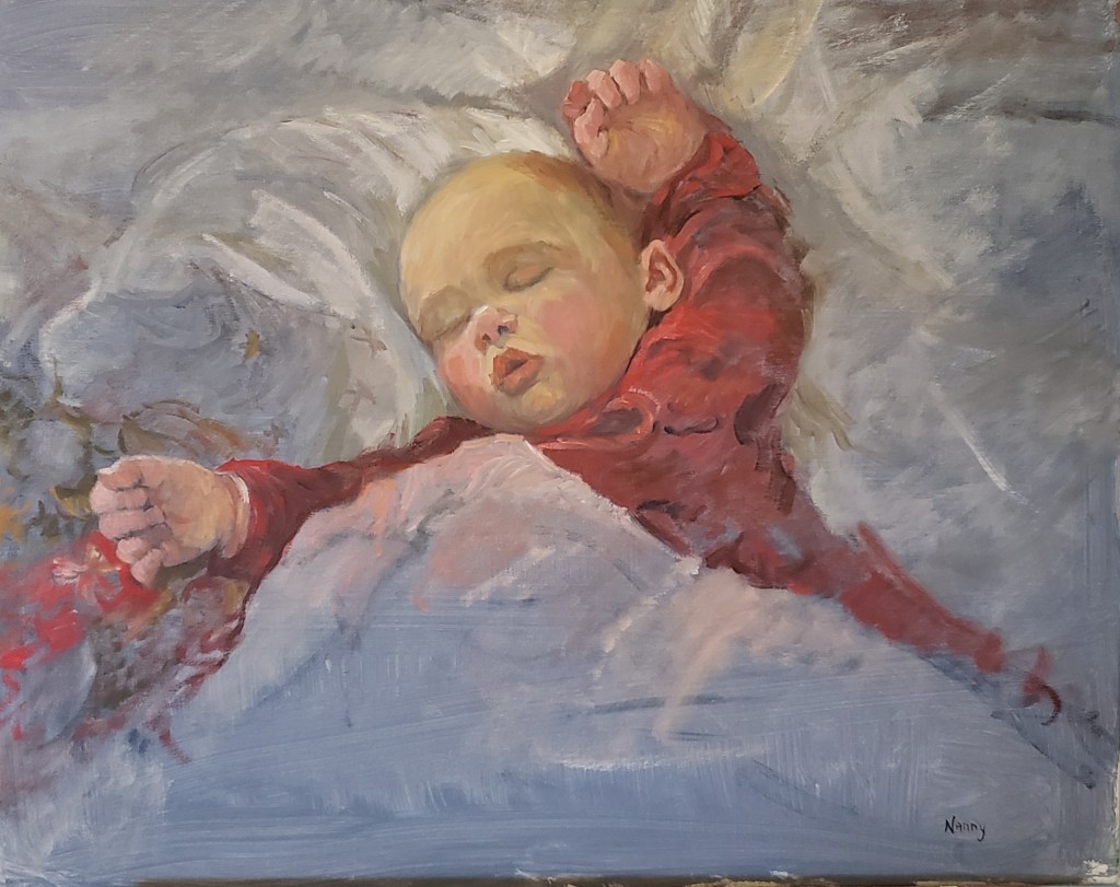
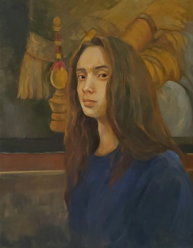
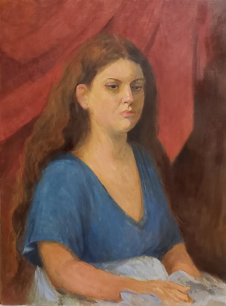
Hello Everyone, Spring is finally here! I can’t wait to get back outside to do some landscape painting. In the meantime I have been working hard on some personal portrait work of some members of my family and also continuing to participate with the Hood Portrait Group. I have always enjoyed figurative work and in some of these paintings I utilized a very limited palette used painters of the past such as Anders Zorn, a Swedish painter 1860-1920 The Zorn Palette, also known as the Apelles palette uses four colors Vermilion, ivory Black, Flake white and Yellow ochre. Instead of Flake white and Vermilion I am using Titanium White and Cadmium Red respectively. “There is evidence that this palette has been in use by painters since the 4th Century BC; Pliny referred to the painter Apelles of Kos’ tetrachromatic palette, which comprised red, yellow, black and white pigments.”
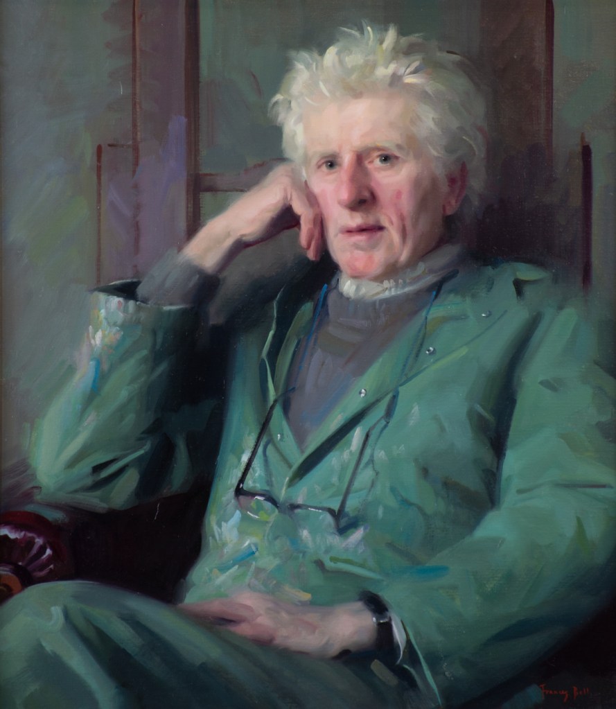
A contemporary British painter, Frances Bell also uses this limited palette combination. Frances uses just four colours for the flesh tones: ivory black, vermilion, yellow ochre and lead white. Additional colours are used as necessary for clothing and background. She is a wonderful painter and I greatly admire her style. To see more of her work check out: https://www.francesbellpaintings.co.uk/about-frances
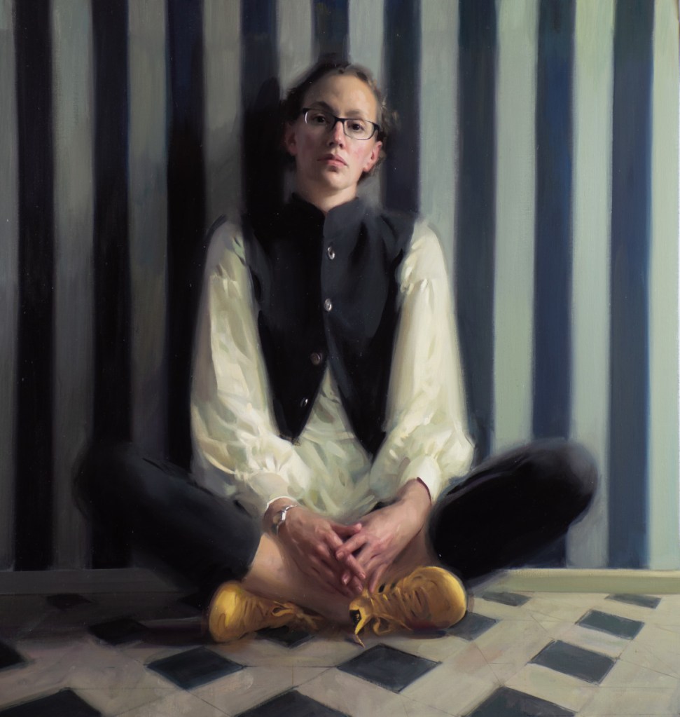
Yellow Trainers, 35.5″ x 37.5″, Oil on Canvas
For the most part I stuck with the Zorn Palette in the flesh tones and hair, hat but used an additional color of cerulean blue in the dress and pool. I also introduced viridian green in the grass and bucket.

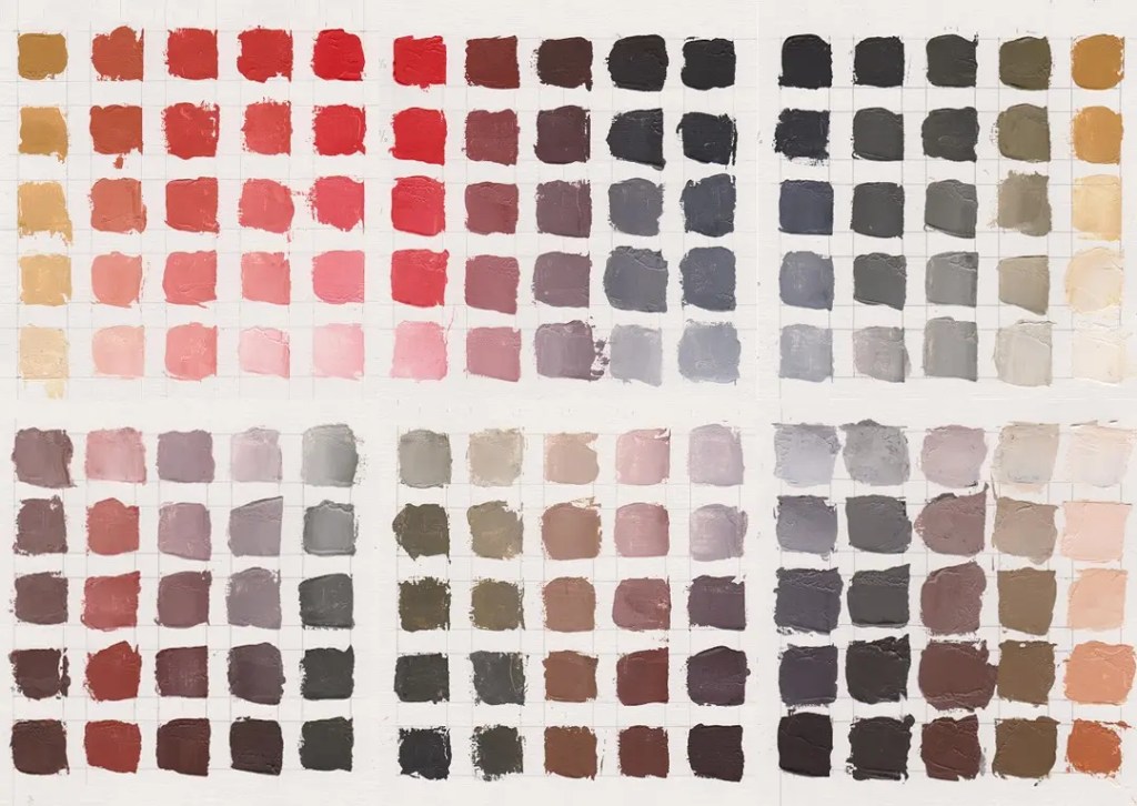
The above chart, ( thanks to Jackson’s Blog, Published: 2nd February 2021 by Lisa Takahashi). will give you an idea of the myriad of color mixtures you can achieve just using these 4 colors. I am really enjoying this challenge. If you would like to learn more about the Zorn palette see these post: https://www.jacksonsart.com/blog/2021/02/02/colour-mixing-exploring-the-zorn-palette/. https://michaellynnadams.com/zorn-limited-palette/
Here is another interesting youtube about the Zorn Palette: https://www.youtube.com/watch?app=desktop&v=ai_cGQxoYP8
Happy Painting Everyone1
Jeanean

Jeanean, Your portraits are beautiful, I am sure your family loves them. Thanks for sharing your work and adventures,Dotti
LikeLiked by 1 person
Dear Dotti, so good to hear from you. I have sent you several emails and did not get a response. Can you send me your current email? I hope you and Bill are well. Love, your fearless leader…….
LikeLike
I am the other one you don’t know but who admires your work. I hope you can find her. Have you tried FB? Maybe you an track her down on there.
LikeLike
oh my goodness. sorry about that. thank you though.
LikeLike